Travel Caribbean Logo

Introduction

This is an alternative way to view the readme. If you would like to see the readme as it is meant to be viewed, please navigate to the GitHub repository for this website HERE

Portfolio Project One: HTML/CSS Essentials - Code Institute - Deadline 1st July 2021

This is my submission for Code Institute's (5P) Portfolio Project One. It is a fictitious company with corresponding website which provides the service of planning customers' holidays in The Caribbean. The website is created with HTML and CSS as well as with the use of many other technologies. The website covers the most basic function of the company: "The new way to plan your Caribbean getaway", the steps a customer can take to get started on their holiday ideas, reviews from customers, a gallery page and a page to download the company's brochure which is published every month, as well as two pages to help the customer make the decision of where they would like to go (Islands) and what type of holiday they would like to partake in (Types). There are also contact links at the bottom of all pages with personal links to my own Instagram account as many static images have come from my own photography portfolio (from index.html, gallery.html and contact.html, as well as the background images of the brochure downloadable).

A live demo of the website can be found HERE

Demo of Travel Caribbean Landing Page

UX

As more people rely on accessing services online the role of UX design has become increasingly important in our digitized world. The five planes provide a conceptual framework for breaking down the task of designing experiences into component elements so that we can understand the problem as a whole [1]. As this framework is structured, extensively used and consistently reliable, I have chosen to use the Five Planes method to design and implement my own website.

Strategy


Vision

Travel Caribbean is a specialist travel website focusing on travel to the Caribbean. Planning a holiday to the Caribbean can be daunting and confusing for many people due to the massive amount of choice that the Caribbean provides [2][3]. As a frequent traveler to the Caribbean, I felt there was a gap in the market to provide potential travelers to the Caribbean with a straightforward and easy means of learning about the potential locations to travel to, and the different types of holiday they can go on, as well as the different activities and excursions customers can go on once they are in the Caribbean to experience the best the Caribbean has to offer. Much like an online travel-agent, I hope the website can provide confidence to customers to take the leap and book their holiday to the Caribbean as there are so many amazing things to see and do, as well as incredible cultures to experience. From personal experience however, I have found that many online travel agent websites are confusing to navigate and have an overabundance of information, it is my aim to make my own website easily navigable and provide customers with a structured and logical delivery of information. By doing this, it will encourage customers to stay on the site and want to use the company's services rather than navigate away from the page due to information overload.

Aims

  1. To earn commision from partner companies that are advertised via the website
  2. To earn income from customers by charging a fee to plan and organise their Caribbean Holiday (fee included in overall holiday price)
  3. To build a database of customers that have used the services of the website for future holidays
  4. To be easily find-able via search engines
  5. To be shareable between current customers and potential customers for potential future revenue
  6. To help customers decide on where they would like to go on their Caribbean Holiday
  7. To help customers decide on what type of holiday they would like for their Caribbean getaway
  8. To help customers decide what they would like to do on their Caribbean Holiday for excursions and activities
  9. To visually help customers by providing a gallery page of images taken in the Caribbean
  10. To provide customers with an easy to use and intuitive contact form to be able to request extra information
  11. To make the site intuative and easily usable to enable customers learn about the Caribbean
  12. To provide customers with a downloadable brochure to advertise examples of package holidays they can have in the Caribbean

Target Audience

There are a number of target audiences for this website due to the range and number of different locations and holiday types on offer.
The theory of potential target audiences are as follows:

User stories

Customer
As a new AND returning customer I want to...
  1. Know the purpose of the website as soon as I navigate to the home/landing page
  2. Navigate the website quickly and effectively
  3. Find everything in the website that I need to find with ease
  4. Learn about the different locations that are available to me as a holiday destination in the Caribbean
  5. Learn about the different holiday types that are available to me
  6. Have a visual aid to help the decision making process of what I would like to do on my holiday to the Caribbean
  7. Have a visual aid to help the decision making process of where I would like to go on my holiday to the Caribbean
  8. Know what other customers have said about the company to ensure the company is genuine and good at what they do
  9. Have some examples of what the company can offer to me for my holiday in the Caribbean via a brochure
  10. Have updated deals and offers from the company for potential Caribbean holidays
  11. Have a quick and easy way to contact the company/for the company to contact me
  12. Have updated information about locations in the Caribbean that may or may not be suitable for travel at that time
  13. Have links to social media platforms related to the company to view further customer testomonies
  14. Have links to social media platforms related to the company to view further images of potential locations and excusrions
  15. Be assured that the locations and excursions advertised by the website are rated and reviewed by customers not affiliated to the company
  16. Browse the website and get information from the company without an obligation to book a holiday
  17. Have easy navigation to external sources to further knowledge of different locations to aid in decision making
  18. Have an online booking form to be able to book my holiday with Travel Caribbean
  19. To be able to log in to the website and alter my booking if necessary
Business Operator
As the business operator I want to...
  1. Create and maintain a database of clients and customers that have organised travel to the Caribbean via the website
  2. Create and maintain a database of clients and customers that have expressed interest in travel to the Caribbean via the website
  3. Create and maintain a database of external companies that do (and would like to) work in partnership with Travel Caribbean
  4. Ensure the website is easily maintainable by software developers by having intutitive and neat code
  5. Have any media content displayed in the website accessible at all times via a linked file system
  6. Ensure all navigation links (internal or external) are always fully functional for ease of use
  7. Ensure the website is fully accessible to users that may have visual imparement
  8. Ensure the website is intuitive for all age groups and abilities
  9. Gain commission from external companies advertised via the website and in partnership with the company
  10. Gain income from customers via a fee placed within the total price of the booked holiday to the Caribbean
  11. Create a visually stimulating environment for customers to see what is available to them during a Caribbean holiday and increase the likelihood of booking and future potential revenue
  12. Stand out from other forms of online travel agent to reduce the chance of customers booking Caribbean holidays via competitors
  13. To provide customers with links to associated social media sites
Partnership Company
As a company in partnership with Travel Caribbean I want to...
  1. Ensure that Travel Caribbean is a company with good reputation that I can affiliate my own company with
  2. Ensure that any commission paid to Travel Caribbean will result in a guarenteed flow of customers to my own company for guaranteed future revenue
  3. Have a fast and easy way to contact Travel Caribbean to discuss partnership terms and commission fees
  4. To have little competition with other external companies affiliated with Travel Caribbean that offer similar products to my own commpany
  5. Have any advertising via Travel Caribbean to be positive and promotional
  6. Have a fast and easy way for customers to be able to navigate to my own company's website via Travel Caribbean

What's in and what's out?

Opportunity/Feature Feasibility/ Viability (score out of 5) Level of Importance (score out of 5) In or out?
Obvious role of the website demonstrated with hero image/video and capture text 5 5 In
Simple design with straightforward navigation to make it easier for the user to understand where to find information 4 5 In
Past customer testimonies to show the company is genuine and trustworthy 5 4 In
A downloadable brochure for customers to view at their leisure 4 4 In
An easy to find and intuitive contact form for customers to be able to discuss their holiday wants and needs with the company 4 5 In
High levels of up-to-date information on the different places customers can go on their holiday and different types of holiday they can have 4 3 In
Footer on all pages containing social media links for customers to view further information and more customer testimonies 5 3 In
A highly visually interactive website to show the customer what they are able to experience from a Caribbean holiday 5 4 In
A database of external companies affiliated with Travel Caribbean to make it easier for customers to plan excursions and experiences 4 3 In
A database of clients and customers from past holidays and a database of clients and customers of potential interest 2 4 Out
A Fully accessible website able to be experienced by customers with visual imparement 4 5 In
A booking form for customers to be able to book their holiday with a login option to manage their booking 1 2 Out
Average Viability x number of features:
47
Sum of Importance:
42

As we can see from the table above, the viability is higher than the importance, which is good because that means most of the features are able to be implemented, however we must be careful not to implemnt features that would be unneccessary for the website and cause potential confusion for the customer. I must also be careful to stay within the scope of my own coding limitations - implementing features that I have no knowledge or experience of could cause a high liklihood of bugs and errors in the website which would in turn reduce the potential of a positive user experience.

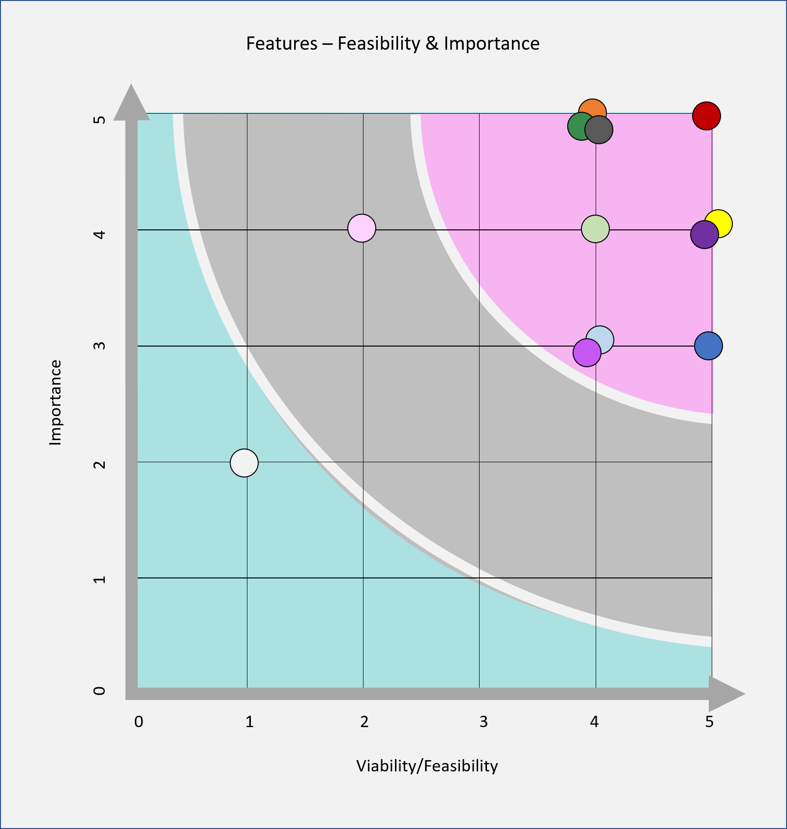
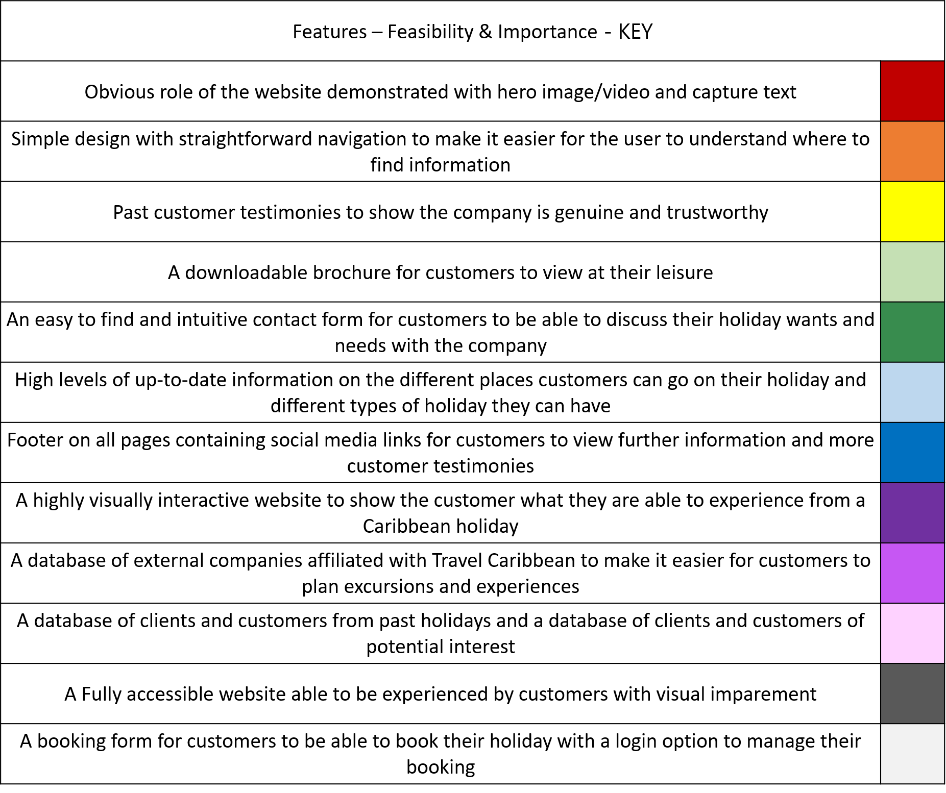
I have plotted the table above into a graph to easily visualise the features that will be implemented into the website and which ones won't be:
Graph depicting the features that will be included in the website
Key to show which circles on the graph represent which feature

Scope

Due to the pitfalls of developing a website based on the MVP (Minimum Viable Product) model such as lack of user experience and enjoyment due to a lack of content, I have chosen instead to base the development of my product using the MMP (Minimum Marketable Product) as this allows a fully functional application to be used by the customer and can solve user problems with the minimum amount of features while still being completely usable [7] - this however does mean that more time must be spent developing and deploying the application without the guarantee of user satisfaction and possibly result in some 'rough edges' that need to be rectified and de-bugged at a later date. By using this method, any feedback from customers will be based on a fully working web-app and result in fully qualitative data due to the product being in a finished state; rather than feedback based on a web-app that has intentionally been left incomplete resulting in feedback from customers who may believe the site to be inadaquate due to lack of content and intuitiveness.
I have been able to confidently use the MMP model due to my own history of travel to the Caribbean and booking holidays in this area of the world. As a customer myself, I can base the functions needed for the website on my own needs and wants from the past, as well as for the future. By incorporating into the website features that I would want to see on websites that I book my own holidays on, I hope that my wants and needs will translate to the wants and needs of the customers visiting the Travel Caribbean website. The MMP model will: While following the MMP model, to meet the user and business goals, my website will include:

Structure

I have chosen to carry out a non-linear method of design for this website as it consists of multiple pages which might not necessarily be viewed in a particular order as each page has a different role to play. By having multiple page we can separate large amounts of information into logical sections to make it easier for the user to find what they are looking for. The navigation bar at the top of all of the pages allows the user to easily navigate to the page of the website they are most interested in. There are also certain pages (islands.html and types.html) that have their own internal navigation sections due to these pages being split into logical sections for different islands and different types; these internal page navigation areas mean that the user can be even more specific about what they would like and find it easily.

On index.html: I chose for the 'hero video' to be at the top, the next section to be text to capture the user and to further explain the function of the website, the next section to explain the steps the customer should take in choosing their holiday - this section is very straightforward and minimal to allow for intuitive browsing, the next section to be holiday types - just the types, no extra information, then the review section and finally a link to the contact form and brochure. This is the layout that I found to be most logical; as the user moves down the page they are slowly given the information they need in order to organise a holiday to the Caribbean with the company - this avoids information overload and increases the chance of the customer staying on the website. Some of the sections in index.html also have links within them to be able to navigate to other pages on the site to allow for intuitive browsing - whenever this is available to the user, the destination of the link always has a back button just in case the user wants to go back to where they were before e.g. the user clicks on the 'Beach' type button on in the index page which will take them to the Beach section of types.html, however they may want to go back to the index page to the area they were at previously - the back button provided will take them there. I wanted these sections on the home page to be the most important to the user as they have key information within them.

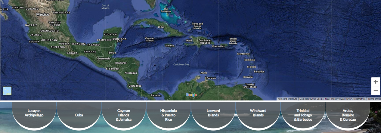
On islands.html: I chose to have an iframe at the top from Google Maps, to allow the customer the opportunity to do some exploring of the area themselves should they wish. Under the iframe there is an internal nav area, each link representing a different island or island group. These are mainly organised geographically from the islands at the top of the caribbean moving round in a clockwise fashion ending with the ABC islands. Organising by geographical location made most sense to me, and would make it easier to find particular islands on the iframe map. Within each of the sections I have included a back-to-top button, as the page has a lot of information, I didn't want the user to be constantly scrolling up and down the page to see what other island options there are by viewing the nav-bar.

On types.html: I chose to have the same types section from the home page as the internal nav bar, this provides continuity and familiarity for the user. Underneath the nav bar there are nine sections, each representing a type of holiday the customer could have. These don't have a particular order, however I have tried to arrange them as possible popularity - these can easily be moved around and re-ordered as necessary in the future. Within each of the sections I have included a back-to-top button, as the page has a lot of information, I didn't want the user to be constantly scrolling up and down the page to see what other types of holiday there are by viewing the nav-bar.

On gallery.html: I have included a large number of images, as from personal experience I like to look at images of places before I choose them as a potential holiday destination. Under the images, I have also incuded videos via YouTube iframe, these videos are made and published via external sources and are to further help the customer decide where they would like to go on holiday and what they would like to do.

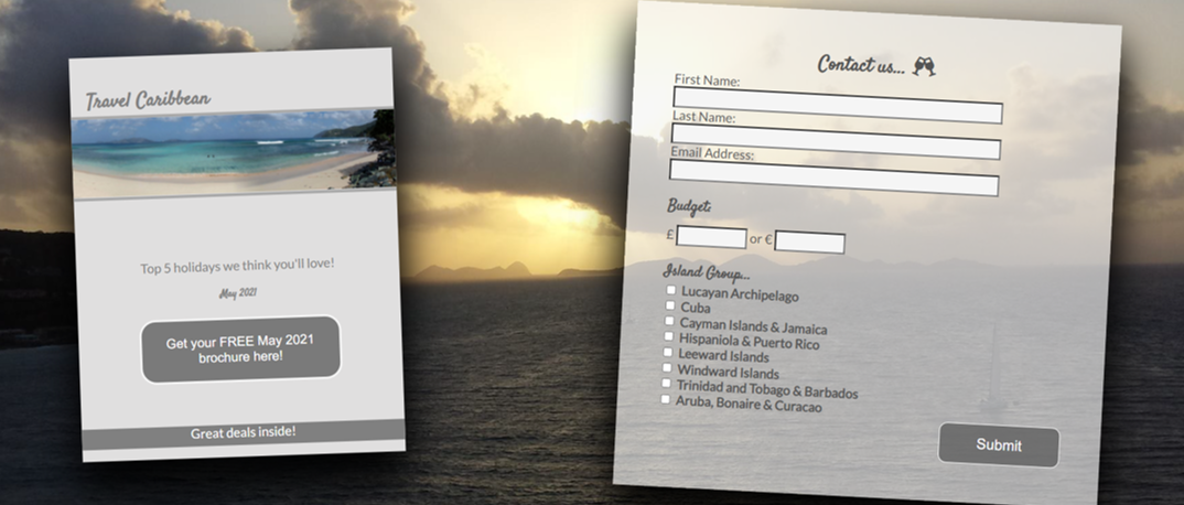
On contact.html: There are two main sections - one for the downloadable brochure and the other for the contact form. The image of the brochure contains a button to be able to download the brochure pdf file.

Skeleton

The wireframes for the Travel Caribbean website were made with the Balsamiq Desktop Applictaion, they can be found by viewing the image below and following the links below the image. As there is a number of pages within the website all containing a fairly large amount of content, I chose to create the wireframes based on a desktop layout as this is how I intend for the website to be viewed most frequently, however I have also created a wireframe for the contact page in mobile version, as the layout of this page will change a lot from being in desktop version to mobile version.
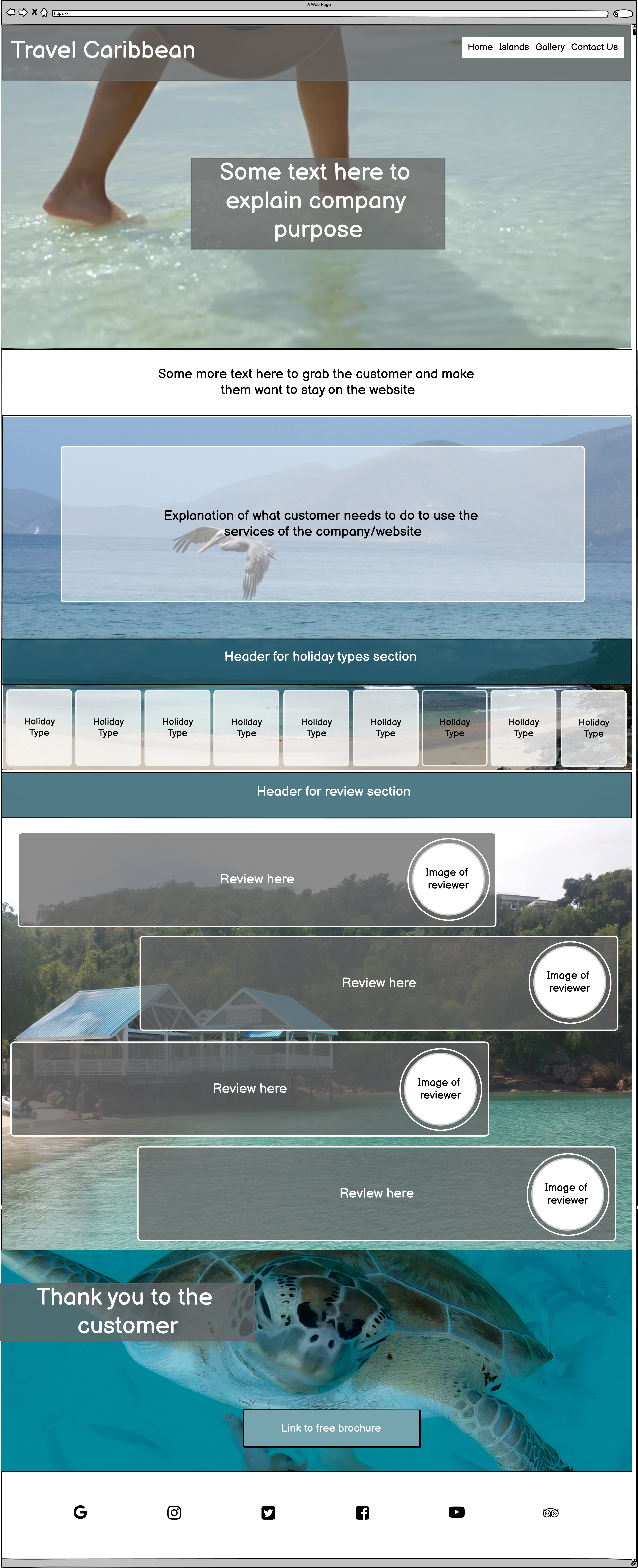
Wireframe plan of index.html
The wireframes were created during the website's initial desgin process, as such there are small changes between the layout of the wireframes and the final layout/design of the finished website. The website as designed via Balsamiq is divided into five main sections (Home, Islands, Types, Gallery and Contact), however there are also eight 'hidden' pages which are navigated to via the Islands page (these are to view the small thumbnail map images in a larger way and all have identical layouts), as well as the page which is navigated to via the submit button (the 'Thanks' page) in the contact form and the 404 error page. The 'Thanks' and 404 pages have almost identical layouts as it didn't make sense to have a completely different layout for these pages due to the low frequency of visits these pages may recieve - these pages are identical to the first section of the index page; I felt this added continuity and design flow to the website, the only differences between them is the video used in the background. Due to the website being heavily visual, I chose to focus mostly on which images I would use as backgrounds in the wireframe process to ensure that the images complimented each other, and the images sizes worked with the design of the web page that it was situated within.

Surface


Typography
I used Google Fonts to find the typography that I wanted to use for the website. I wanted to use a completely different font for the main title and the headers to the main text body of the website to distinguish between headers and main body, but also to show the importance of different sections and make it obvious for the user/customer when a new section is starting. I chose to use the font 'Satisfy' (seen below) as the cursive writing and free-flow design of it makes it feel more relaxed and whimsical - which is remeniscent of the Caribbean. I initially used an alternative cursive font however this wasn't as easy to read and could have been difficult to understand for those that do not have english as a first language.
Font used for headings
I did however have some minor problems with this font such as certain letters in lower case looking like other letters (see example below where the word 'or' actually looked like the word 'on'), however this only occured once in the website and was rectified by putting the word in uppercase.
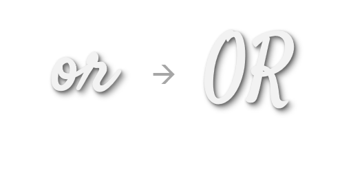
Problem with using the satify font
The font I used for the main text body of the website was 'Lato' as this font is easy to read which is needed when there is large amounts of information to be read and absorbed by customers, it has a modern feel, and is a popular font for many websites. The back-up font is 'Sans-Serif' just in case the font import link fails.

Colour Scheme
As I want the website to be very visual, it made most sense to me to choose a colour scheme based on an image that is regularly used throughout the site. When I think of the Caribbean, I think of the blue and turquoise waters of the sea, so wanted to have the colour scheme pulled from an image that has these colours within it. I chose the image that is repeated at the bottom of the main pages of the turtle, as this has the blues that remind me of the Caribbean.
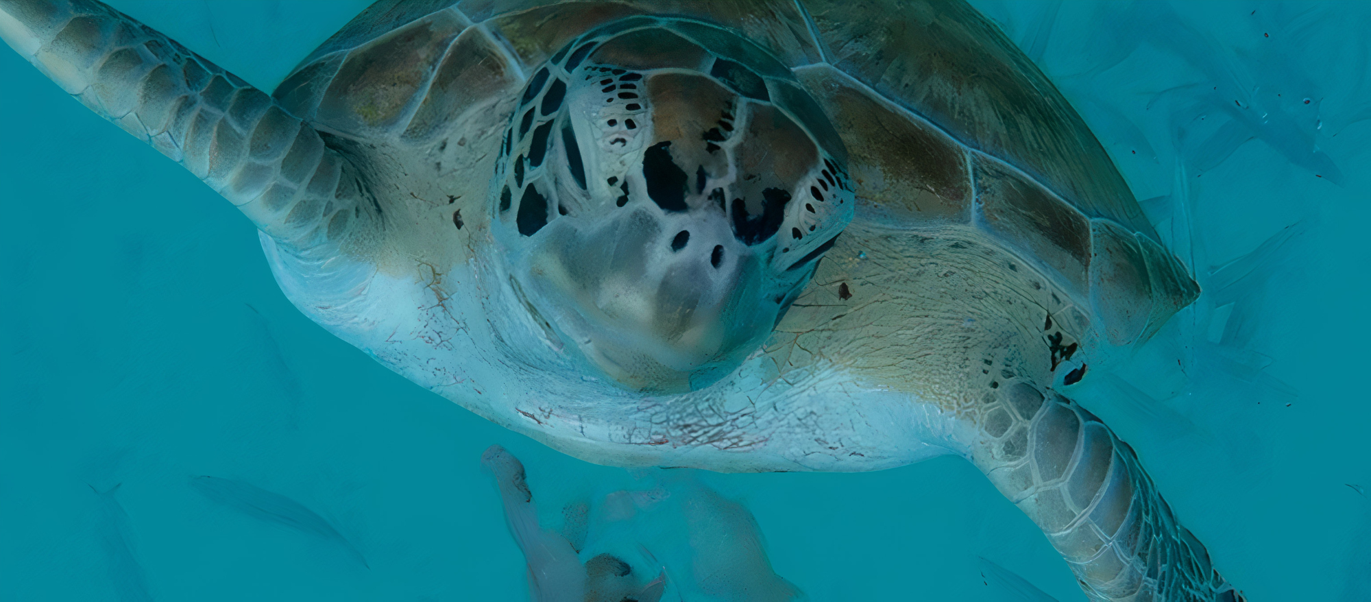
Image used to generate colour pallette
I then used the website colormind.io as this allows the creation of a colour pallette from an image rather than a single colour choice. The colour pallette below is the pallette generated from the turtle image. Generated colour pallette
I really love the range of blues and will use these throughout my website as background colours and decoration colours. The majority of the pages on the website will have image backgrounds to aid in the visual appeal of the website, however I still want some continuity of colour throughout. As the majority of backgrounds are images, many of the text overlays will have to have a neutral background to have the text be more readable without clashing with the background image, therefore I have chosen the majority of text boxes to have the neutral colour of grey - ranging from darker greys on backgrounds that have a more toned down overall colour (such as the hero video in index.html and the background of the review text boxes):
Image showing background colour of text box over the hero video Image showing background colour of text box in the reviews section
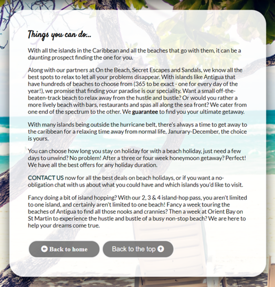
To lighter and less transparent grey on backgrounds that are more vibrant and could cause problems with reading text (such as those in islands.html and types.html):
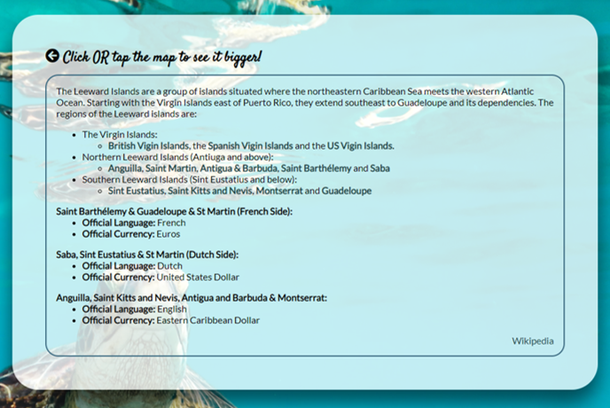
Image showing background colour of text box in islands.html Image showing background colour of text box in types.html

Icons
The icons used in the website were taken from Font Awesome, they can be seen throughout the site, are used on all pages for the social media links, and are used as calls to action in the Islands and Types pages to aid in navigation. Font Awesome is also the source of the icon used in the tab of the browser for Travel Caribbean.

The icon used in the header section of the website on all pages was designed in Microsoft Powerpoint. It is made up of a generic png image of some palm trees and incorporated with a border, shadows and light blue eliptical shape (to signify the sea).

Design - Images
All stationary images on the Home, Gallery and Contact pages, as well as the background images in the downloadable brochure were taken from my personal photography portfolio, I felt that as I have a personal connection to the majority of the photographs on the website, I would have a better understanding of how the images interact with everything else on the page, I also had the advantage of knowing where each photograph was taken, so the labels on the images in the Gallery are all true and accurate.

The reviewer portraits are actually images of my family (names are falsified for annonymity), so are images either taken by myself or members of my family.

The stationary images on the Islands and Types pages are aquired from Pexels, as these sectional areas are quite large and need to have backgrounds of good quality no matter the screen size, I felt it was important to have images of high resolution, many of the images in my portfolio were not the correct orientation or of high enough quality, so pexels was a great resource for aquiring images to fit the needs of the website.

The images in the downloadable brochure of the hotels were taken from the hotel sites themselves:
Design - Video
All background videos on the website were also aquired from Pexels, I was limited a little in terms of which videos I was able to use due to the limitations on file sizes that can be pushed to and stored on GitHub. It is not best practice to store files of this size on GitHub, however for this particular project (being educational), I chose to use the video compression software Free Convert Video Compressor to reduce the file size so all videos had a file size of around 5MB (GitHub limit is 10MB). I wanted to use videos that were of a 'slow-motion' nature to reflect the relaxation and calmness that can come with holidays to the Caribbean. I also wanted to use videos that don't have a lot of variation in colour to ensure continuation of accessibility thoughout the videos duration of text that is overlayed (such as the cover text in the Home page, 404 page and thanks page).

The videos embedded at the bottom of the gallery page were all taken from Youtube, these are generic videos of different places in the Caribbean to inspire the customer and give them ideas about what they might like from their holiday to the Caribbean.

Technologies

Throughout the planning, design, testing and deployment of the website, I have used a number of technologies:

Languages

  1. HTML
    • The main structure of the website
  2. CSS
    • For the design of the site
  3. Limited JavaScript
    • For importing the kit from Font Awesome
    • For the hamburger menu on all pages at small screen sizes
  4. Limited Python
    • For hosting a local server during for testing
  5. Markdown
    • For the content and structure of the README.md
  6. Bash
    • For the CLI of gitpod.io environment and commands for depoloyment to GitHub

Version Control

  1. Git & Github
    • For the hosting and version control of the website as well as storage for media content on the website
  2. Gitpod
    • The development environment used for writing the code for the website

Applications

  1. Balsamiq (Desktop)
    • For the creation of wireframes
  2. Visual Studio (Desktop)
    • For testing out ideas without interfering with code for website
  3. Microsoft Publisher
    • For creating the downloadable brochure
  4. Slack (Desktop)
    • For communicating with peers and troubleshooting problems with the different environments used during the course and coding.

Frameworks, Libraries and Programs

  1. Chrome Developer Tools
    • To test the responsiveness of the website at varying screen sizes
  2. Colormind.io
    • To create the colour pallete of the website based of an image
  3. Google Fonts
    • Used to import the 'Satisfy' and 'Lato' fonts used throughout the website
  4. Font Awesome
    • Used on all pages throughout the website to enhance UX and design, also for the tab icon
  5. Ezgif
    • Used to create the Demo gif in the readme file
  6. Favicon.io
    • Used to create the tab icon from an original PNG file
  7. W3C Markup Validation Service
    • To test and search for errors in the HTML code
  8. Jigsaw W3C CSS Validation Service
    • To test and search for errors in the CSS code
  9. Am I responsive
    • To show the responsiveness of the website on different screen sizes at the same time
  10. LetsEnhance.io
    • Used to increase the resolution of background images to ensure the quality is high no matter the screen size
  11. WAVE Web Accessibility Evaluation Tool
    • To ensure compliance with accessibility
  12. A11y Color Contrast Checker
    • To ensure compliance with accessibility
  13. Free Convert Video Compressor
    • To reduce the file size of the background videos used on the website

Features

Deciding what to Implement

The main features to be implemented in the website were determined in the Strategy plane of the UX section. Below is the table as a summary of which user stories we are able to implement and which we are not (due to time contraints and developer knowledge limitations).

Opportunity/Feature Feasibility/ Viability (score out of 5) Level of Importance (score out of 5) In or out?
Obvious role of the website demonstrated with hero image/video and capture text 5 5 In
Simple design with straightforward navigation to make it easier for the user to understand where to find information 4 5 In
Past customer testimonies to show the company is genuine and trustworthy 5 4 In
A downloadable brochure for customers to view at their leisure 4 4 In
An easy to find and intuitive contact form for customers to be able to discuss their holiday wants and needs with the company 4 5 In
High levels of up-to-date information on the different places customers can go on their holiday and different types of holiday they can have 4 3 In
Footer on all pages containing social media links for customers to view further information and more customer testimonies 5 3 In
A highly visually interactive website to show the customer what they are able to experience from a Caribbean holiday 5 4 In
A database of external companies affiliated with Travel Caribbean to make it easier for customers to plan excursions and experiences 4 3 In
A database of clients and customers from past holidays and a database of clients and customers of potential interest 2 4 Out
A Fully accessible website able to be experienced by customers with visual imparement 4 5 In
A booking form for customers to be able to book their holiday with a login option to manage their booking 1 2 Out
Average Viability x number of features:
47
Sum of Importance:
42

Implemented Features

From the table above, I was able to recognise which features were more likely to have a positive impact on the website and implement those.

Features Left to Implement

Due to time constraints and limitations of coding knowledge I have chosen not to try and implement the following features to the website:

Testing

To make the testing of my website easier and more structured, I have decided to carry out an 'eight-phase' approach: Functionality, Compatibility, User Testing Stories, Code Validation, Peer Review, Development Problems, Accessibility and Performance Testing

Functionality


The first phase of my testing regime for the website was to look at the functionality of the website and make sure that it meets the needs of the customer on the most basic levels and also to ensure that all the interactive aspects of the website all worked with no problems.
I tested the usability and intuitiveness of the website using different focus groups divided by age:

Age Group Quantity Comments
16-25 2
  • All participants knew the function of the website at first glance
  • All participants found the website easy to navigate
  • All participants found the website to be highly visual and appealing in terms of design
  • Both Participants viewed the website on their phones
26-35 6
  • All participants knew the function of the website at first glance
  • 5/6 participants found the website easy to navigate, the 6th participant needed prompting on where to go from Home page
  • All participants found the website to be highly visual and appealing in terms of design
  • 3 Participants viewed the website on their phones
  • 1 Participant viewed the website on their iPad
  • 1 Participant viewed the website on their Android tablet
  • 1 Participant viewed the website on their Desktop PC
36-45 5
  • All participants knew the function of the website at first glance
  • All participants found the website easy to navigate
  • All participants found the website to be highly visual and appealing in terms of design
  • 3 Participants viewed the website on their phones
  • 2 Participant viewed the website on their Android tablet
46-55 6
  • All participants knew the function of the website at first glance
  • 5/6 participants found the website easy to navigate, the 6th participant needed prompting on where to find the contact page
  • All participants found the website to be highly visual and appealing in terms of design
  • 3 Participants viewed the website on their phones
  • 3 Participants viewed the website on their iPads
56-65 4
  • All participants knew the function of the website at first glance
  • All participants found the website easy to navigate, however all needed some minimal prompting throughout via leading statements such as "You can learn about different islands" and "There's a downloadable brochure"
  • All participants found the website to be highly visual and appealing in terms of design
  • All Participants viewed the website on their phones
66+ 2
  • All participants knew the function of the website at first glance
  • All participants found the website to be easy once there was an 'introduction' of sorts by the developer explaining the functions of the site
  • All participants found the website to be highly visual and appealing in terms of design
  • Both Participants viewed the website on their Laptops

Compatibility

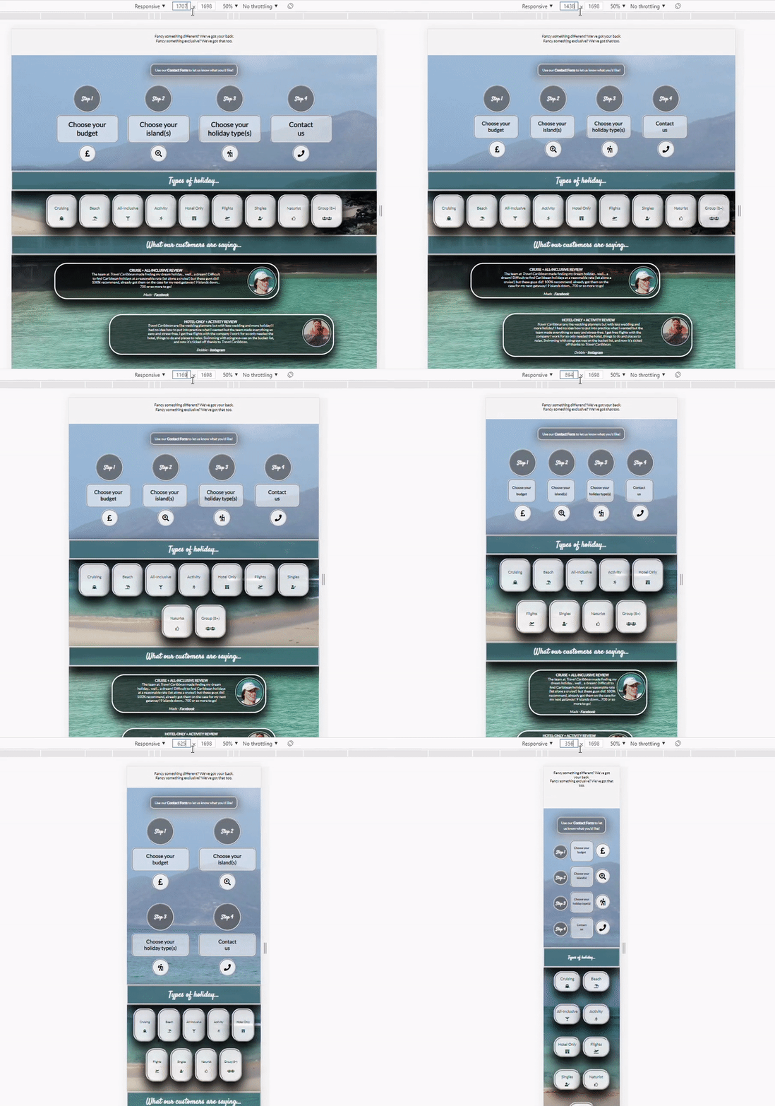
The second phase of my testing regime for the website was to ensure that the website is compatible through a range of devices, screen sizes and internet browsers. Throughout the development process, the website was tested on a number of devices: A 17.3 inch windows laptop, a 15.3 inch windows laptop, a 16 inch MacBook Pro, an 8 inch Samsung Galaxy Tab A, a 10.2 inch iPad, A Samsung Galaxy S20 Ultra and A Huawei P30 Pro. It was also tested in Chrome, Firefox, Internet Explorer and Safari as well as Samsung's own internet browser. By also using Chrome Dev Tools, I was able to manually change the screen size to see when elements within the web pages 'break', by using this method, I could pinpoint the exact screen widths and heights to be defined in the CSS media screen queries and alter the stylings to fit accordingly. As I chose not to have a query for phone sizes, another for tablets and another for PCs and instead chose to base the queries on when things start to look 'broken' this did mean a lot of media queries in the stylesheet, however I found it was the best way to ensure responsiveness and to make sure that all elements within the web page were correctly layed out in relation to other elements. The video below shows how I checked the responsiveness of the website at all screensizes.

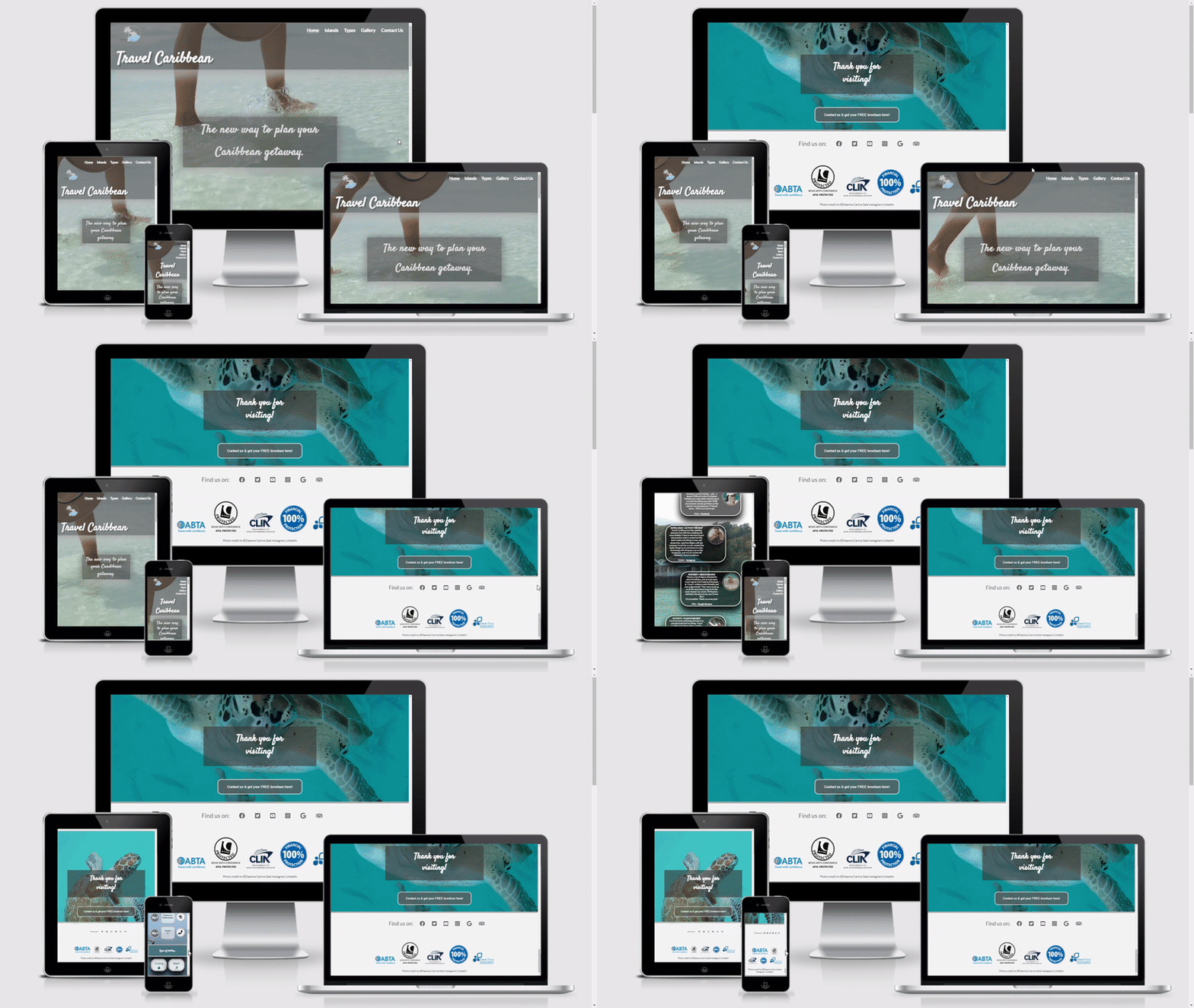
Gif showing responsiveness of website section

User Testing Stories

The third phase of my testing regime was to ensure that customer all user stories identified in the Strategy plane have been acknowledged and achieved.

"I want to know the purpose of the website as soon as I navigate to the home/landing page" & "I want to navigate the website quickly and effectively" & "I want to find everything in the website that I need to find with ease"
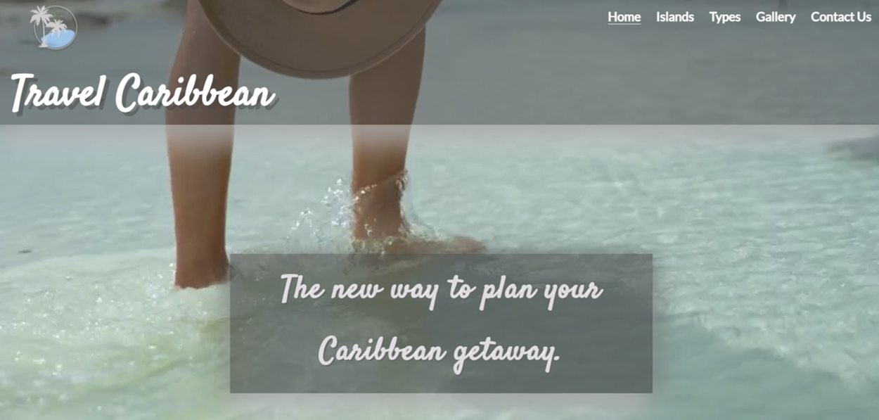
Screenshot of top of landing page
I have tried to make the website as intuitive as possible. From the first time the customer navigates to the home page I have tried to make it so the customer is aware straight away of the function of the website by including relevent video footage and cover text to exaplain what the website is for. As soon as the customer navigates to the home page, the things they should see are as follows: The 'hero' video, the menuu bar, the logo image and the website 'title': Travel Caribbean. I have used straightforward terminology in the navigation bar so the customer knows where they are navigating to and what they will find once they have navigated there. I feel I have succeeded in this area as I had a number of focus groups divided by age all of which found the site easy to navigate, highly intuitive and knew the exact function of the website at first navigation.


"I want to learn about the different locations that are available to me as a holiday destination in the Caribbean" & "I want to learn about the different holiday types that are available to me" & "I want to have updated information about locations in the Caribbean that may or may not be suitable for travel at that time" & "I want to have a visual aid to help the decision making process of what I would like to do on my holiday to the Caribbean", "I want to have a visual aid to help the decision making process of where I would like to go on my holiday to the Caribbean" & "I want to have easy navigation to external sources to further knowledge of different locations to aid in decision making"
Screenshot of top of islands page
Screenshot of top of types page
There are separate pages within the website (islands.html and types.html) for the customer to browse at their leisure to learn about the different islands they can go to and the different types of holiday they can go on. These sections also have up to date information on the best places to go and which places might be best to avoid (such as those in the hurricaine belt at certain points in the year, or those than have been badly affected by hurricanes in the past). There images in the backgrounds of the types sections to give the customer inspiration of what they might like to see or do on that particular type of holiday (such as scuba diving in the activity type), there is also a large gallery for the customer to browse including videos to further inspire the customer and to help them decide what they might like from their holiday. Within the information sections, there are also external links provided for the customer to be able to further their knowledge of different places and holiday types from other resources.


"I want to know what other customers have said about the company to ensure the company is genuine and good at what they do"
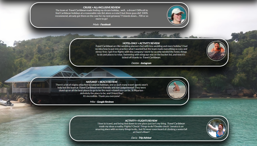
Screenshot of top of reviews section
I have included customer reviews in the index page as I felt it was important that these were in a prominent place and easy for the customer to find. As they are on the home page, the customer doesn't need to navigate anywhere to see the reviews, they just need to scroll down. I know from personal experience that a lot of purchases (not just holidays) are based on the reviews and testimonies from past customers.


"I want to have some examples of what the company can offer to me for my holiday in the Caribbean via a brochure", "I want to have updated deals and offers from the company for potential Caribbean holidays" & "I want to browse the website and get information from the company without an obligation to book a holiday"
Screenshot of top of downloadable brochure
The downloadable brochure (available from the button on the brochure mock-up in the Contact page) gives the customer a number of example holidays that they can book without having to make their own decisions about the details of their holiday. It shows the customer what the company can offer without them having any feeling of obligation to use the company. It contains up to date deals and provides the customer with a discount coupon - an incentive to use the services of the company.


"I want to have a quick and easy way to contact the company/for the company to contact me"
Screenshot of top of contact page
The form on the contact page is easy to find and straightforward to fill in. The input boxes are of a sensible size for the input type and the boxes that have to be filled in have the 'required' attribute attached to them. Due to the limimtations in my knowledge base and the fact that this project is based around HTML and CSS, I was limited in the functionality of the form, however with the use of PHP the form could be able to send a generic email to the customer to let them know we will contact them soon, or send them a more involved form to fill out for the company to better understand their wants and needs.


"I want to have links to social media platforms related to the company to view further customer testomonies", "I want to have links to social media platforms related to the company to view further images of potential locations and excusrions" & "I want to be assured that the locations and excursions advertised by the website are rated and reviewed by customers not affiliated to the company"
Screenshot of top of reviews section
All external links on the web page will open in a new tab so the customer is not completely diverted away from the website. There are links to social media platforms, where further reviews, images and information would be avalable for customers to view, in the partnership boxes there are links to external companies affiliated with Travel Caribbean, these companies have their own websites and own customer base which will not have been brought to them via the Travel Caribbean website.


Code Validation

The fourth phase of my testing regime for the website was to ensure all code written passes through code validation software with no errors or warnings.

HTML Code Validation

Below is a run-through off the code validation process of all pages on the website, all of the pages did come back with errors - some very small, some larger! However all errors and warnings were rectified and all pages now pass through validation with no errors or warnings.

index.html
The below code validation report is from index.html. There were minimal errors found on this page. The main 'errors' were repeated id attributes, this was rectified by replacing the id attributes with class attributes instead. HTML validation report from W3C

islands.html
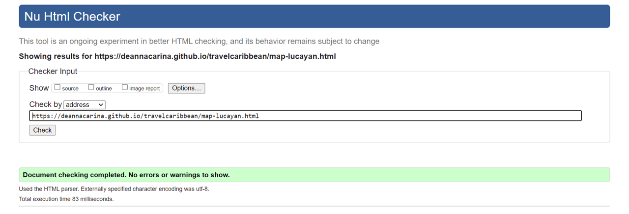
The below code validation report is from islands.html. There were a few validation errors on this page concerning the iframe found at the top of the page containing the interactive caribbean map. One of these was the text within the iframe opening and closing tags - the validator classed this as an error; I found this to be a problem with w3schools rather than the validation service itself by finding a GitHub thread concerning this matter HERE. There were also problems with using percentages as height/width and using px as a height/width definition. As I wanted to ensure responsiveness of the iframe, to work around this error, I gave the iframe an id attribute and styled the element within the CSS instead. Once the iframe errors has been rectified, a clean validation report was returned.
HTML validation report from W3C

types.html
The below code validation report is from types.html. There were minimal errors for this page, the only reported errors were that one or two sections did not contain a heading. To fix this problem, I added heading elements to the sections, but styled the text as transparent and nil display.
HTML validation report from W3C

gallery.html
The below code validation report is from gallery.html. There were a few validation errors on this page concerning the iframes found in the video section of the page. One of these was the text within the iframe opening and closing tags - the validator classed this as an error; I found this to be a problem with w3schools rather than the validation service itself by finding a GitHub thread concerning this matter HERE. There were also problems with using percentages as height/width and using px as a height/width definition. As I wanted to ensure responsiveness of the iframe, to work around this error, I gave the iframe an id attribute and styled the element within the CSS instead. Most of the errors concerning the iframes in the gallery page were brought about by the pre-built code from Youtube's embedding option. Once the iframe errors has been rectified, a clean validation report was returned. The error report from before code cleanup can be found HERE.
HTML validation report from W3C

contact.html
The below code validation report is from contact.html - the page website visitors are directed to when the form on contact.html is submitted. It needed a slight alteration to change the back 'button' from a button element to a div element as the code validator showed an error when the button was wrapped in an anchor element.
HTML validation report from W3C

404.html
The below code validation report is from 404.html - the page website visitors are directed to when an invalid web address is used. It needed a slight alteration to change the back 'button' from a button element to a div element as the code validator showed an error when the button was wrapped in an anchor element.
HTML validation report from W3C

Large map page linked via islands.html Wireframe
The below code validation report is from one of the pages used to magnify the map thumbnails from islands.html. All of the validation reports were identical for these pages as they are almost identical (the only difference is the map image and the heading text). All of these needed a slight alteration to change the back 'button' from a button element to a div element as the code validator showed an error when the button was wrapped in an anchor element.
HTML validation report from W3C

CSS Code Validation

The main edits that I needed to make to the CSS file during code validation were as a result of changing ID's to Classes in the html files and having stylings for the iframes in the CSS rather than in-element stylings. The only 'errors' that came back were for some stylings (around 3 or 4) that I had accidentally given a value of '0', these were removed and the code re-run through the validator, it then passed with no errors or warnings. CSS validation report from W3C

Peer Review

As a students of Code Instutute we have Slack as a resource to help and compliment our learning. We are able to post our web pages and GitHub repositories for other students to review. I would like to thank Oliver Cadman and Matt Boden for taking the time to look at my website and for pointing out some of my mistakes. All problems identified by my peers were rectified straight away. Extra pairs of eyes really do make a huge difference in the development of websites.


Issues found during development

Due to the limitations of only working with HTML and CSS, I found it quite difficult to make some of my ideas a reality - such as a custom interactive map in islands.html. It was my intention to have a static map (image) of the Caribbean but then have different islands 'light up' when the customer hovers over them and have a label appear to state which island it is. I found some pre-made JavaScript code to be able to do this, however decided it would be more challenging (and rewarding) to meet the aims of the website while staying within the confines of HTML and CSS.

Accessibility

"By making your website accessible, you are ensuring that all of your potential users, including people with disabilities, have a decent user experience and are able to easily access your information. By implementing accessibility best practices, you are also improving the usability of the site for all users." [8]
Due to the importance and necessity of accessibility on websites, I have chosen two independant accessibility evaluation tools: Wave Accessibility and A11y Color Contrast Checker. I chose two in order to cross-check accessibility and ensure the website passes tests from more than one source. For all pages in the website the accessibility evaluation and improvement process was as follows:
  1. Run the web page though the A11y Color Contrast Checker
  2. Run the web page through the Wave Accessibility
  3. Rectify any errors that resulted from the Wave Accessibility check regarding code errors and contrast errors
  4. Re-run the web page through the A11y Color Contrast Checker
  5. Compare results from the two A11y Color Contrast Checker analysis to ensure all previous errors are rectified.
This seemed to be the most efficient way of ensuring all accessibility criteria were evaluated and addressed. As A11y Color Contrast Checker specifically looks at colour contrast, I felt it was important to rely on this more as a way to look at contrasting colours. Wave Accessibility is a very good all-round tool and very good at pointing out where the problems are, so I used this tool to pin-point the problems to then fix them, but then confirmed the colour contrast errors in the page were fully rectified by re-running the web page through A11y Color.


index.html

This page was run through both accessibility validation programs and found to have no problems*.

islands.html

This page had some problems with colour contrast of the 'back-to-top' button used in the island sections. To rectify this, the background of the button was made darker and slightly less transparent. The page was then re-run through the accessibility checker and no errors were returned.

types.html

This page was run through both accessibility validation programs and found to have no problems*.

gallery.html

This page was run through both accessibility validation programs and found to have no problems*.

contact.html

This page had some problems with colour contrast of the brochure download button and the banner used in the brochure mock-up. To rectify this, the background of these elements were made darker and slightly less transparent, the page of the brochure was also made pure white. The page was then re-run through the accessibility checker and no errors were returned.

thanks.html

This page was run through both accessibility validation programs and found to have no problems*.

404.html

This page was run through both accessibility validation programs and found to have no problems*.

Large map pages

All of these identical pages were run through both accessibility validation programs and found to have no problems*.

*On running the all pages through the Wave Accessibility program - all pages came back with the same SIX errors: The social media links in the footer all required an aria-label due to the lack of text within the anchor element. Once the aria-label had been added, all pages then came back with no code accessibility errors.

Performance Testing

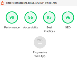
In order to test the performance of the website I used the built-in Chrome DevOps tool Lighthouse This was used on all pages. I found that the results from the Lighthouse testing tool were different every time I tested it even if nothing has changed with the website between tests. The below image is the result from my most recent Lighthouse performance test, which I am very happy with.

Performance report from lighthouse

Deployment

Project Creation

This project was created on GitHub and Edited in GitPod by carrying out the following:
  1. A new repository was created using 'Code-Instutute-Org/gitpod-full-template'
  2. A meaningful name was given to my new repository and I selected 'Create Repository'
  3. I then opened the repository on GitHub and clicked the 'Gitpod' button to build the GitPod workspace which would allow me to build and edit the code used to make the Travel Caribbean Website
  4. Version control was used throughout the project using the following commands in the terminal using Bash
    • git add . OR git add "file name" - to stage the changes and get them ready for being committed to the local repo.
    • git commit -m "Description of the update" - to save the change and commit the change to the local repo
    • git push - to push all committed shanges to the GitHub repo associated with the GitPod workspace
    • commit --amend - I am prone to typing errors, this command came in very handy for changing the wording or spelling of the most recent commit
    • git reset "commit hash" - I only used this a couple of times when I decided to take certain sections in a different directions e.g. resize all images to a certain size, commit and push, but then decide I want them to be bigger/smaller.
    • git push -f - This was used to force changes through to the GitHub repo if either "commit --amend" or "git reset" were used

Project Deployment

This project was deployed via GitHub pages by carrying out the following:
  1. Log in to GitHub
  2. In the repository section, select the repo to be deployed
  3. In the menu at the top of the page select 'settings'
  4. Select 'pages' in the left hand side menu
  5. In the source section, the 'Master' branch is selected and the save button selected
  6. The web page is then assigned it's URL which will appear in the source section*
*It can take some time for the site to be deployed when the 'save' button is pressed and a URL created.


Local Deployment

There are many ways to deploy the project locally on your own device. The ways I will explain here are: Forking, Cloning, GitHub Desktop and Zip Exctraction, the steps in these processes are outlines below:

Forking the GitHub repo

If you want to make changes to the repo without affecting it, you can make a copy of it by 'Forking' it. This will make sure that the original repo remains unchanged.
  1. Log in to your GitHub account
  2. Navigate to the repository HERE
  3. Select the 'Fork' button in the top right corner of the page (under your account image)
  4. The repo has now been copied into your own repos and you can work on it in your chosen IDE
  5. If you have any suggestions to make regards to the code to make the site better, you can put in a pull request

Cloning the repo with GitPod

  1. Log in to your GitHub account
  2. Navigate to the Repository HERE
  3. Select the 'Code' button above the file list on the right had side
  4. Ensure HTTPS is selected and click the clipboard on the right of the URL to copy it
  5. Open a new workspace in GitPod
  6. In the bash terminal type 'git clone [copy url here from step 4]'
  7. Press enter - the IDE will clone and download the repo
  8. You can then type 'python3 -m http.server' to host the website locally

Github Desktop

  1. Log in to your GitHub account
  2. Navigate to the Repository HERE
  3. Select the 'Code' button above the file list on the right had side
  4. Select 'Open with GitHub Desktop'
  5. If you haven't already installed GiHub desktop application - you will need to follow the relevant steps to do this
  6. The repo will then be copied locally onto your machine

Download and extract the zip directly from GitHub

  1. Log in to your GitHub account
  2. Navigate to the Repository HERE
  3. Select the 'Code' button above the file list on the right had side
  4. Select 'Download Zip'
  5. Once you have the Zip downloaded, open it with your prefered file decompression software
  6. You can then drag and drop the files from the folder into your chosen IDE or view/edit them on your local machine

Credits

Code

Content

Images

All images seen on the website apart from those listed below are from my own photography portfolio, some of these images can be found on my Instagram page and some on my Facebook page in the Caribbean Cruise Albums.

Pexels Images


Unsplash Images


Video

Pexels Videos


Acknowledgements

Screenshots

Screenshot of index.html

References

  1. [1]U. Qureshi, "UX Design using the Five Planes Method", Medium, 2021. [Online]. Available: https://medium.com/ designcentered/ ux-design-5-planes-method-b1b1d6587c05. [Accessed: 06- Jun- 2021].
  2. [2]Lonely Planet, 2021. How to choose a Caribbean island – [online]. Available: https://www.lonelyplanet. com/articles/ how-to-choose-caribbean-island [Accessed: 05- June- 2021].
  3. [3]Caribbean Currency, Thomas Cook, 2021. [Online]. Available: https://www.thomascook.com/ holidays/caribbean/travel-money. [Accessed: 05- Jun- 2021].
  4. [4]"10 Backpacking Myths That Shouldn't Stop You Traveling - Backpacker Advice", Backpacker Advice, 2021. [Online]. Available: https://backpackeradvice. com/blog/ backpacking-myths.html. [Accessed: 05- Jun- 2021].
  5. [5]D. Horscroft and D. Horscroft, "Population estimates by marital status and living arrangements, England and Wales - Office for National Statistics", Ons.gov.uk, 2021. [Online]. Available: https://www.ons.gov.uk/people populationandcommunity/ populationandmigration/ populationestimates/bulletins/ populationestimatesbymarital statusandlivingarrangements /2002to2017. [Accessed: 06- Jun- 2021].
  6. [6]C. Jönsson and D. Devonish, "Does Nationality, Gender, and Age Affect Travel Motivation? a Case of Visitors to The Caribbean Island of Barbados", Journal of Travel & Tourism Marketing, vol. 25, no. 3-4, pp. 398-408, 2008. Available: 10.1080/105484 00802508499 [Accessed 5 June 2021].
  7. [7]Django Stars Blog. 2021. Your Guide to MVP, MMP, MLP, MDP and MAP Startup Stages. [online] Available at: https://djangostars.com/ blog/guide-mvp-mmp-mlp- mdp-map-startup-stages [Accessed 7 June 2021].
  8. [8]"Accessibility Basics | Usability.gov", Usability.gov, 2021. [Online]. Available: https://www.usability.gov/ what-and-why/accessibility.html. [Accessed: 12- Jun- 2021].